Mexico City’s LGBTTTIQAP+ Pride March has more than 40 years of history, and although we all understand why it exists, few would know how to define its identity on a visual level. However, as the number one priority during these years has been and will continue to be activism and the constant struggle for the rights of the community, within the movement’s agenda the realization of its own visual identity had never been in its plans until 2022.
Thus, during that year, and hand in hand with Comité InclúyeT (Organizing Committee of the CDMX Pride March), we set ourselves the task of developing a comprehensive visual identity with the idea that the Community could have an image of which to appropriate once and for all.
THE ANGEL OF
INDEPENDENCE:
STARTING POINT
EVERYTHING.
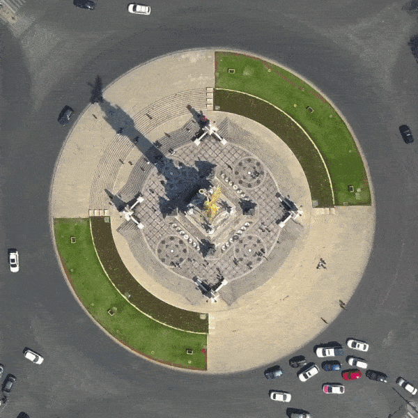
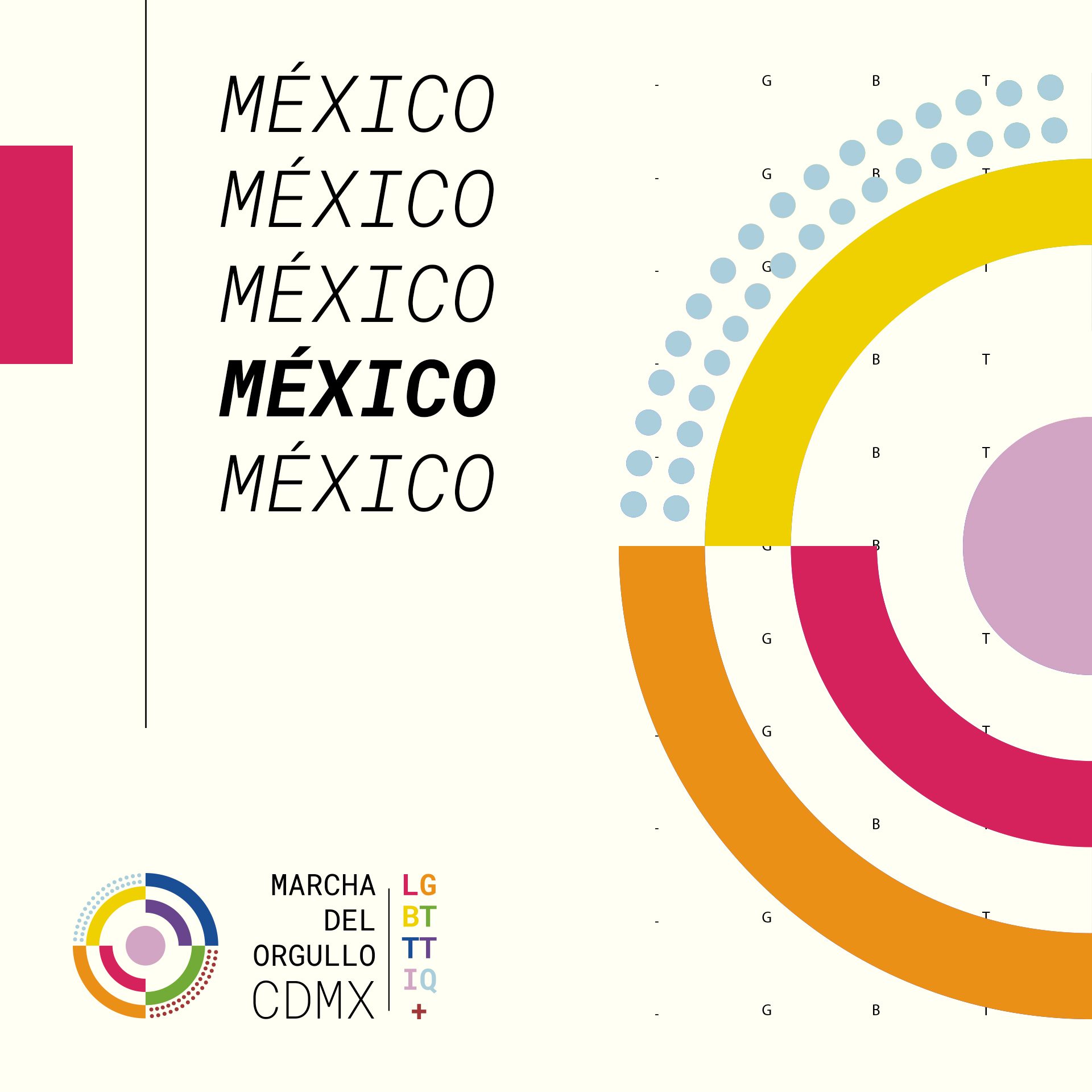
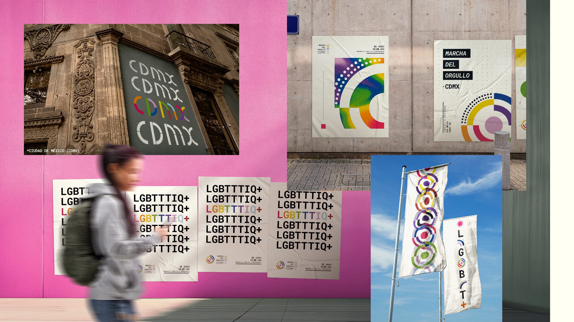
The heart of our proposal is born from the same place where the mobilization begins every year: the Angel of Independence. If we imagine it from a zenithal view, an icon is glimpsed and that’s where it all began. We integrated a dynamic palette that includes all the colors that today make up the multiple flags corresponding to the various identities belonging to the LGBTTTIQ+ community, in order to represent each of the people who belong to it.
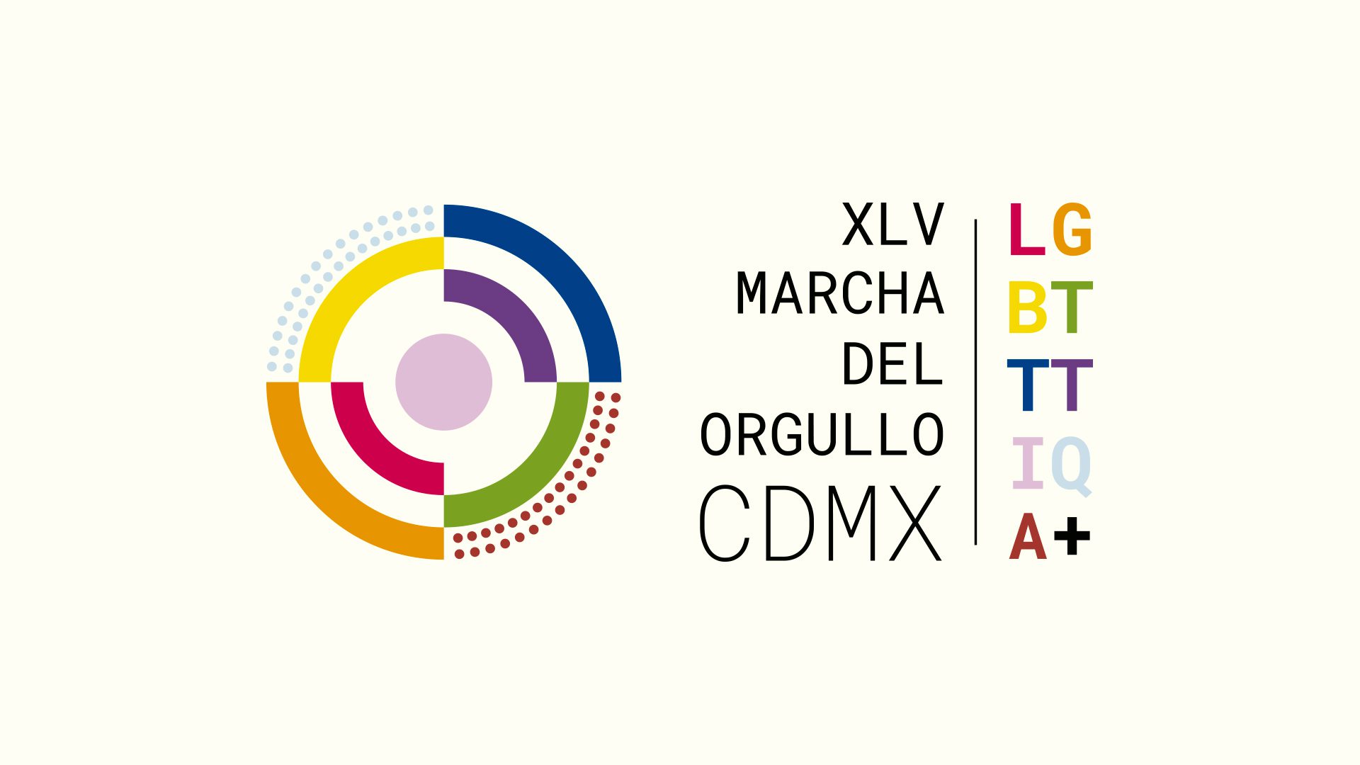
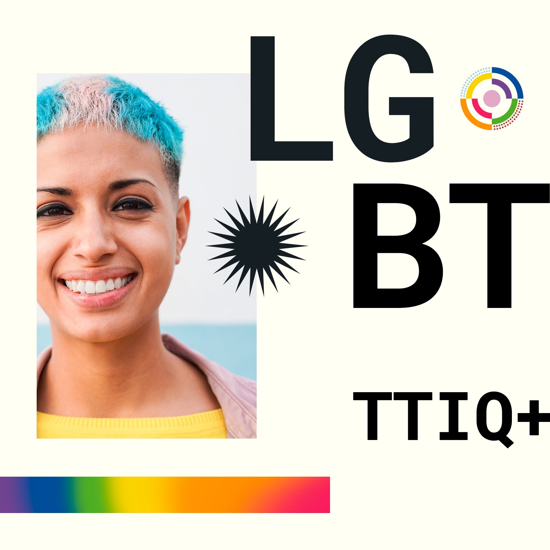
As a result we obtained a modular branding composed of a typographic block that has the virtue of being able to accommodate any number of letters that are added to the acronym, the current year edition, as well as an isotype that in the hand of any person, can be easily replicated, thanks to its composition is based on basic geometric figures.